

Week 2 - This week I started to think about what time of music I was going to base my music magazine was going to be. I wanted to do a type of music that I preferred and like so I would be able to talk about it more passionately. So I decided to use "pop" another reason I chose pop was as I thought there was a gap in the market for this type of magazine. There are quite cheesy pop magazines for younger ages such as “Top of the pops”.
 But I wanted to create a magazine that catered for the older teens say between the ages of 16 - 25 so it’s not too young but not too old. I also had to come up with a name for the magazine. I created a brainstorm of names after allot of deliberation I came up with the name "Pulse" I think this a brilliant name as it reflects the genre and just generally music. Then I try to decide on a font this was very difficult as I wanted it to reflect the name "Pulse" and also the genre and also had to be very strong as it was going to be used as my mask head. I came up with lots of different options and narrowed it down to about 8 and ask a range of people to chose which was their favourite and from that I then narrowed down to a final 4 which I still am deliberating. I think I was chose it on how it looks with the photo.
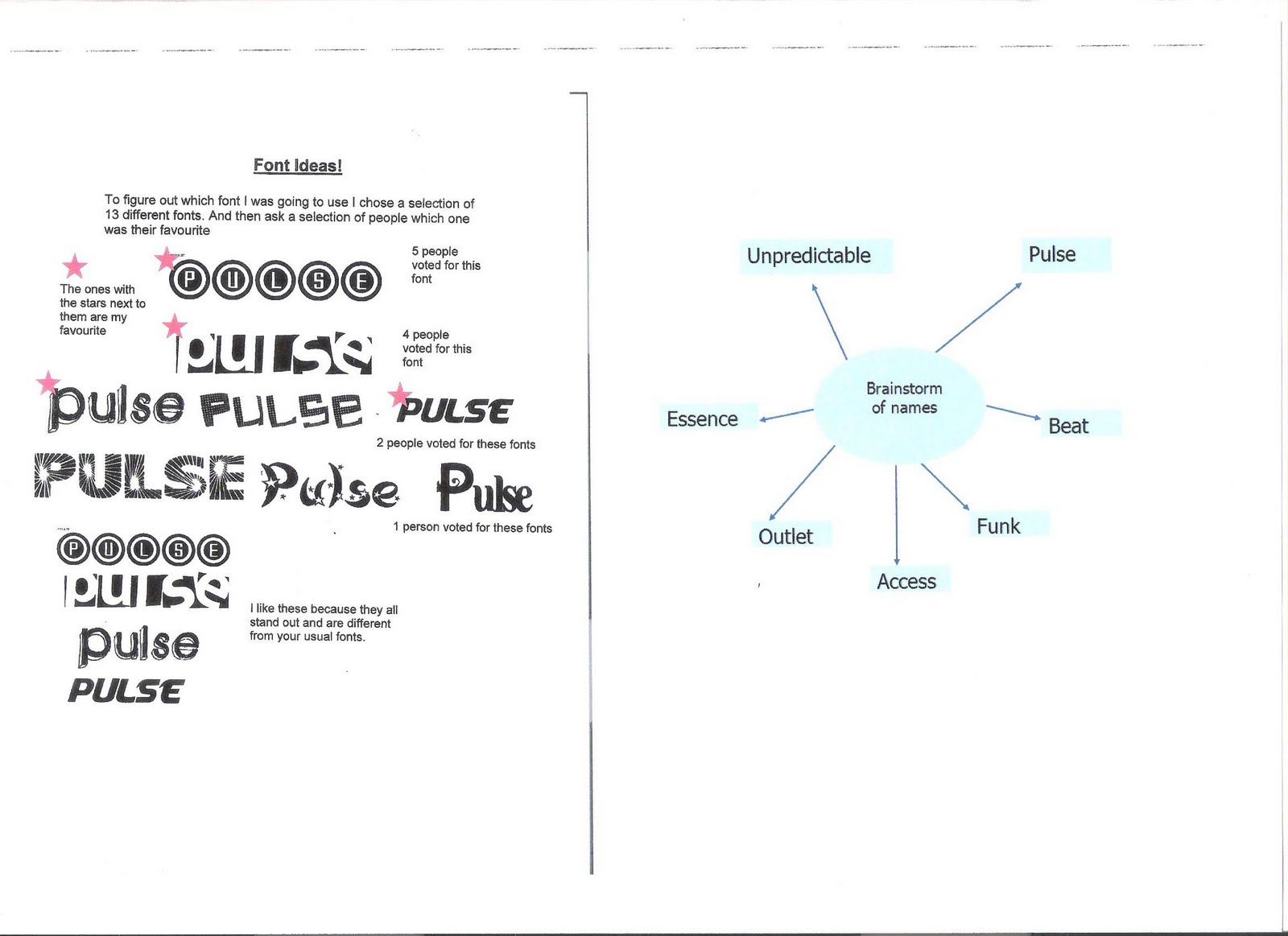
Week 3 - I wanted to find out more on what my target audience wanted from a music magazine so I created a questionnaire. Gave it to my age range and then wrote down all the results this gave me a clearer idea of what I wanted in my magazine. I then wrote my editorial profile which I really liked and help me decided what I wanted to put in my magazine.

Week 4 - I decided this week that I was going to use to put on my cover I chose my friend Rebecca Golder as I think she has the perfect look for my magazine and she will appeal to my target audience. I am now am looking at images to inspire my front page and am about to start a flat plan of the front page, contents page and double page spread.


Week 5 - I have taken all my photos for my front page and double page spread. I am happy with most of them but had trouble decided which photo to use for my front page. However after much deliberation I decided to use this one I decided to use this photo as I thought it was different from other photos. As when you look at magazines front covers you look up at the pop star. Whereas this photo you are looking down at the pop star I think this shows her more down to earth and venerable. I have now started actually making my front page on the Macs. I have used the lasso tool to cut around the outside. This was very time consuming but effective as now I can put a colour on the background.

Week 6 - I have now put white background behind the image. I chose to use white as it is very fresh and eye catching. I have no also chosen a font. The font is quite iconic as it has a heart in the title. I will try and keep this reappearing throughout the contents and double page spread to show continuity. The colours I am using are dark red/pink because it is the same colour as her bra strap and lip-gloss. Also I am using dark blue as it matches the pink very well.

Week 7 - This week I faced a problem. My background is white and so is her top which at first look is fine but now it just blends in with the background. So I have now created another layer and coloured her top in pink, I again used the lasso tool with the paint bucket tool. This now looks a lot better and I am very pleased with it. However I now feel the magazine looks very girlie, which I not sure whiter this is a good thing or a bad thing. I am going to ask feedback from my teachers.

Week 8 - I have now have received feedback from my teachers .l now have edited a few minor details like putting a gradient behind the photo from white to grey. This makes the magazine a lot more official. And the pink and blue colours really help me connect with my audience. Also I have begun to add text.

Week 9 - I have now planned for my contents page. I want the contents page to link to the front page to show continuity throughout the magazine. So I am going to use the same colours and the same font. Also I want to carry the idea through of the heart so the numbers will be inside little hearts. I figured out that I want a photo on the contents page. But I need to take a new photo preferable of a guy as I only have pictures of my front cover and double page spread girl and think I need to aim to a wider audience. So at the moment my contents page is on hold. And I’m going to attempt to start my double page spread.

Week 10 - Have started my double page spread. I have begun to edit the photos which are going to be used in my double page spread. I have used iphoto to edit the photos. I have blurred the edges, made it sharper and contrasted it. I am really happy with the end results. Now I have began to put the pictures onto my double page spread. I have one main photo on the right hand side which takes up most of the room. And then on the other side there is a colleague of photos, which overlap. I am pleased but have just come across a problem. As it may be difficult to write over the pictures as in you may not be able to see certain colours. However then I thought I would just make a text box and write in that. But then you will not see the pictures. I have also decided to find a font to put her name in so it becomes a brand identity for her and shows that she is a well established artist.

Week 11 - I have now taken some photos of a guy for my contents page. I really happy with these photos as they are just want I wanted. And I think I have improved at taking photos as I know what angle looks better. I have now edit the photos and chosen my favourite. I have now used the lasso tool and place it onto a blank document and made it smaller so it doesn't take up all the room

Week 12 – I have now finished my contents page, double page spread and front page. I have added a few more pictures on my contents to make it more visually pleasing. For example I have an included a photo of the JLS concert I went to. And an image of my double page spread so my reader knows what in store. My double page spread is now finished and I have spread the photos around the outside of the writing. The writing is now visible and you can read it. As well I have but the questions and answers in different fonts so it becomes clearer to read. As well I have used a pull out quote saying “Aston confesses to me” to intrigue the reader to read the double page spread. My front page has the same lure now as well.


No comments:
Post a Comment